- Visual Identity
- Brand Design
- Logo
MEDXTRA: WHERE EVERYDAY WELLNESS MEETS GROCERIES
In this project, I had the pleasure of crafting a comprehensive visual identity for MedXtra, a unique brand that seamlessly integrates pharmacy and grocery products under one roof.
My Role:
- Deep Brand Understanding: I delved into the core essence of MedXtra, meticulously interpreting their brand values and target audience.
- Logo Design: Leveraging this understanding, I created a logo that effectively captures MedXtra’s brand identity and resonates with their customers.
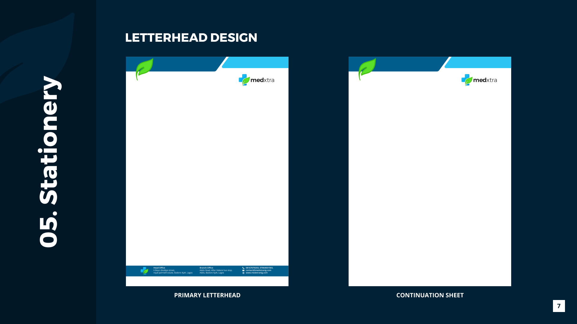
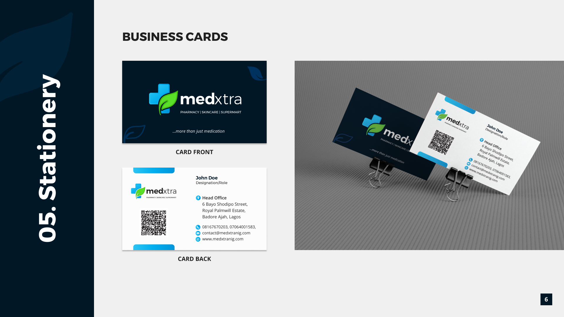
- Brand Guideline Development: To ensure brand consistency across all applications, I meticulously crafted a comprehensive brand guideline booklet. This booklet serves as a reference for internal teams and external partners, outlining proper use of the logo, color palette, typography, and visual style.
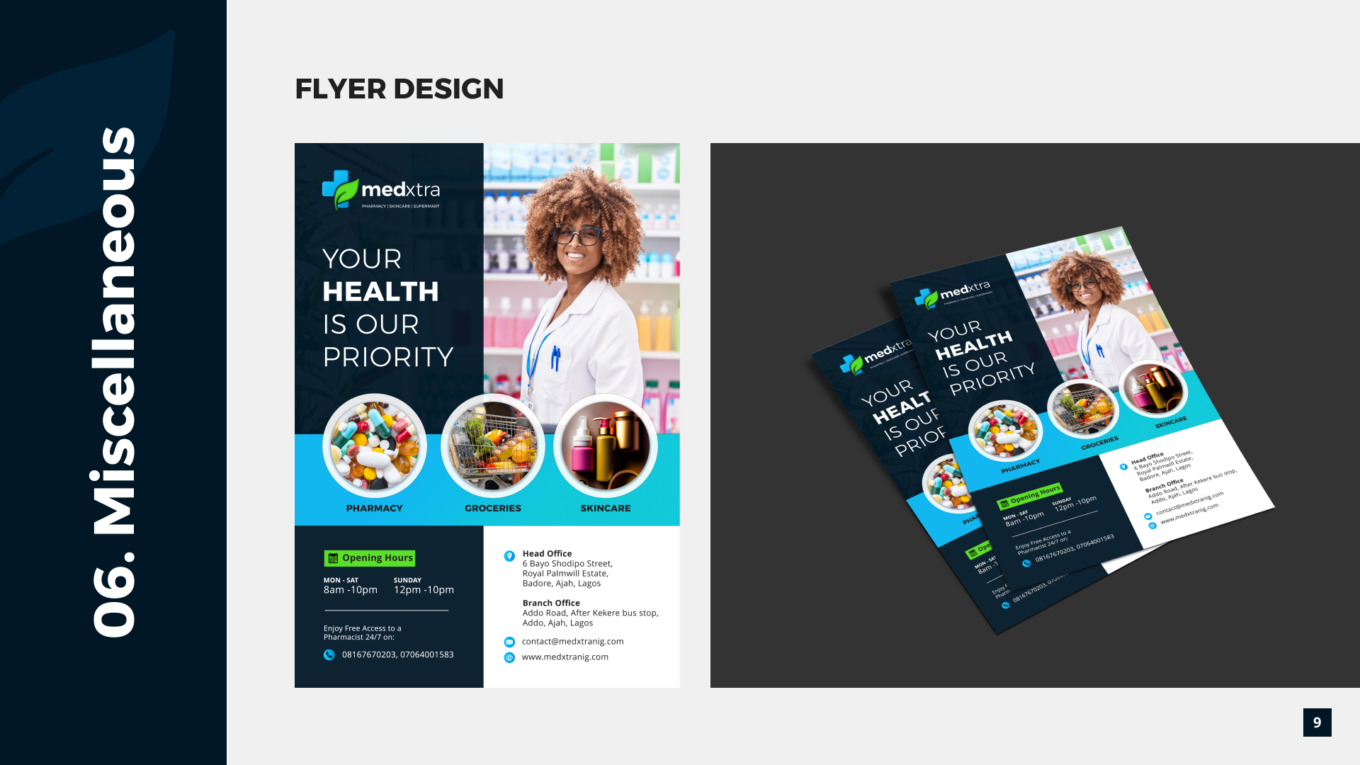
- Marketing Flyer Creation: To support marketing efforts, I designed an eye-catching flyer that effectively communicates MedXtra’s value proposition and offerings.
CLIENT
MedXtra Pharmaceuticals
INDUSTRY
Health & Wellness
ROLE
Brand Designer
TOOLS
Adobe Illustrator, Photoshop, Figma

MEDXTRA: WHERE EVERYDAY WELLNESS MEETS GROCERIES
In this project, I had the pleasure of crafting a comprehensive visual identity for MedXtra, a unique brand that seamlessly integrates pharmacy and grocery products under one roof.
My Role:
- Deep Brand Understanding: I delved into the core essence of MedXtra, meticulously interpreting their brand values and target audience.
- Logo Design: Leveraging this understanding, I created a logo that effectively captures MedXtra’s brand identity and resonates with their customers.
- Brand Guideline Development: To ensure brand consistency across all applications, I meticulously crafted a comprehensive brand guideline booklet. This booklet serves as a reference for internal teams and external partners, outlining proper use of the logo, color palette, typography, and visual style.
- Marketing Flyer Creation: To support marketing efforts, I designed an eye-catching flyer that effectively communicates MedXtra’s value proposition and offerings.
CREATING A COHESIVE VISUAL LANGUAGE
The Challenge :
MedXtra’s unique blend of pharmacy and grocery products presented a challenge in crafting a visual brand identity. This created the need for a distinct visual identity that would address the following challenges:
- Differing Brand Associations: Pharmacies typically evoke feelings of trust and professionalism, often conveyed through sterile blues and greens. Grocery stores, on the other hand, aim for a welcoming and abundant atmosphere, reflected in warmer colors and imagery of fresh produce.
- Unifying Visual Elements: The challenge was to develop a visual identity that successfully merged these seemingly contrasting aesthetics.
The Solution:
To create a cohesive visual language, I implemented a strategic approach:
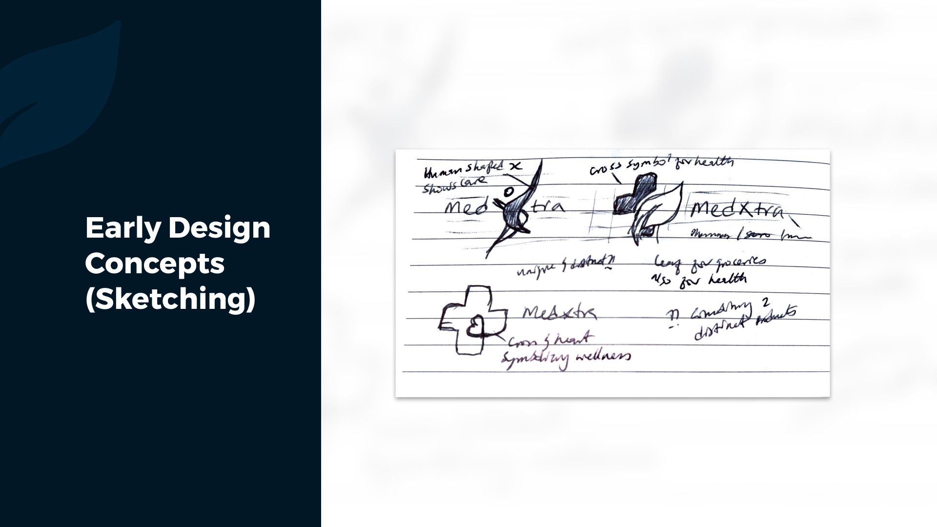
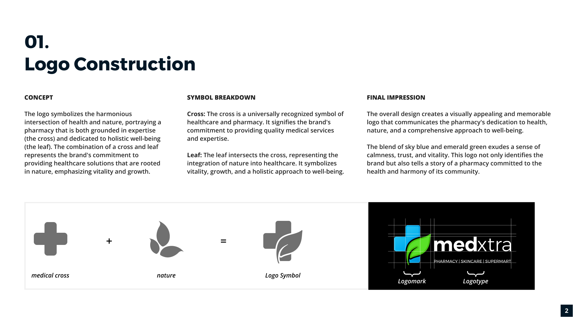
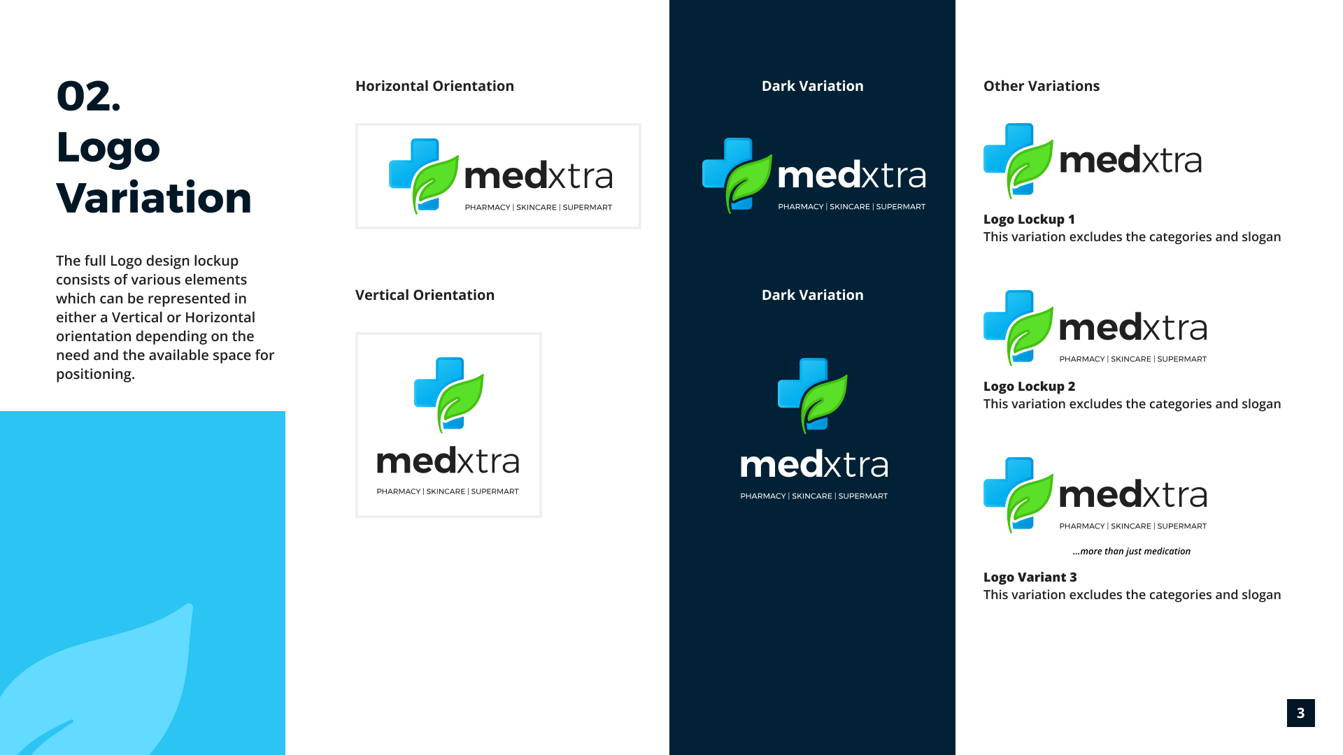
- Logo Design: The logo itself played a crucial role in unifying the brand identity. We explored concepts that combined healthcare imagery with elements representing groceries. Ultimately, the chosen logo design successfully bridged the gap, creating a distinct and memorable symbol for MedXtra.
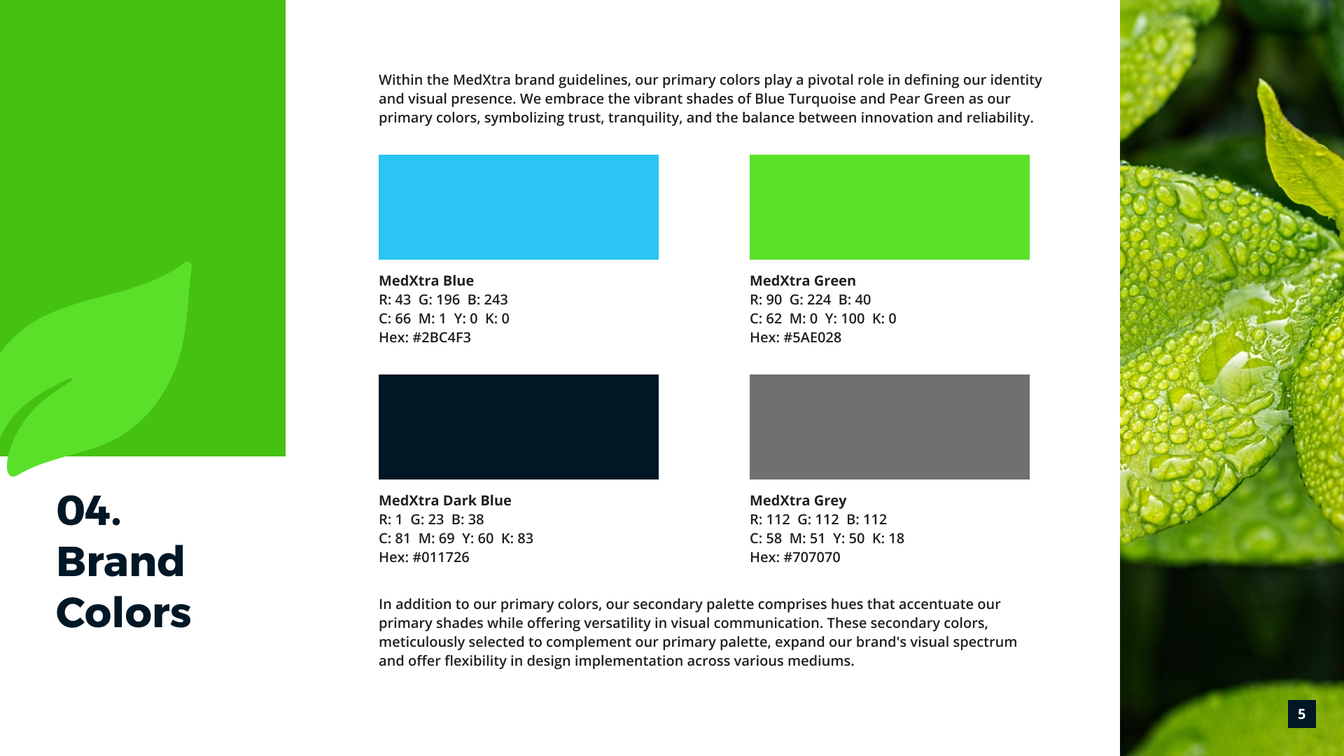
- Color Palette: A calming blue served as the foundation, symbolizing the healthcare aspect. This was then balanced with pops of warm green, representing the freshness and accessibility of groceries.
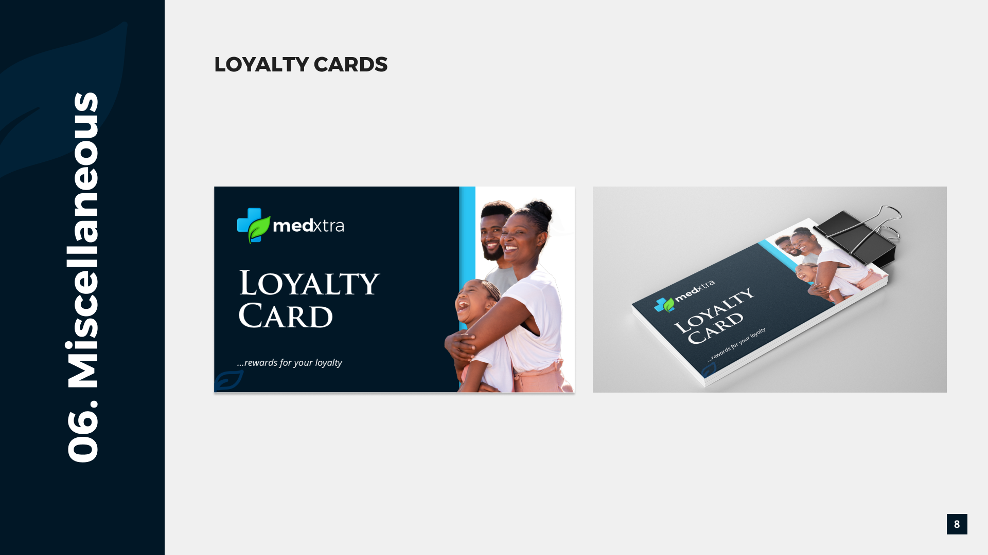
- Imagery: We carefully selected visuals that showcased the synergy between pharmacy and grocery products. Think of images depicting people incorporating both healthy foods and medication into their daily routines.
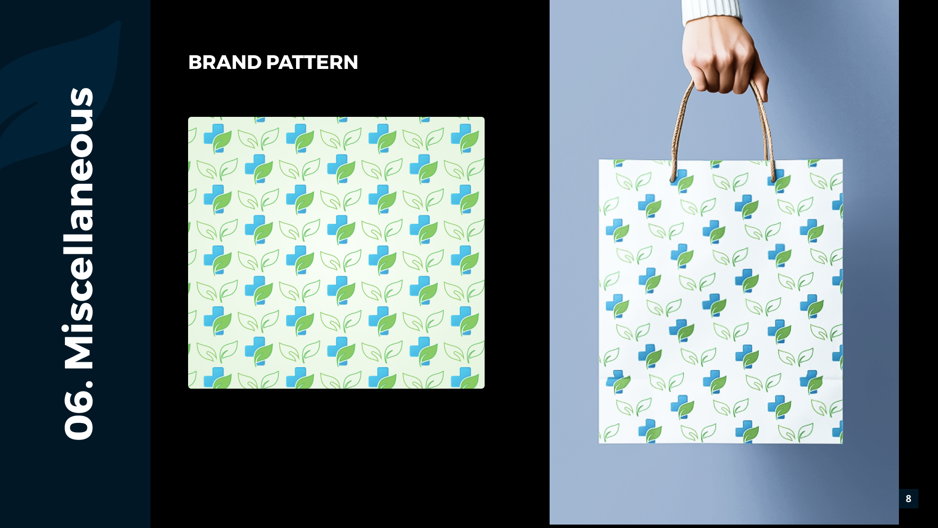
- Graphic Design Elements: We designed icons or patterns that subtly incorporated elements from both worlds, fostering a sense of visual unity.
IMPACT & OUTCOMES
The comprehensive visual identity we crafted for MedXtra resulted in a significant positive impact on the brand’s perception and customer experience. Here are some key highlights:
- Increased Brand Recognition: The cohesive visual language, incorporating a balanced color palette, inviting imagery, and a well-designed logo, fostered a distinct and memorable brand identity for MedXtra. This allowed them to stand out in a competitive market.
- Enhanced Customer Experience: The in-store experience was optimized through clear product categorization, intuitive signage, and a seamless integration of the pharmacy section with the grocery aisles. This made it easier for customers to navigate the store and find what they needed efficiently.
- Improved Brand Perception: The visual identity successfully conveyed MedXtra’s unique value proposition. The warm and inviting elements showcased the convenience of a one-stop shop for both pharmacy and grocery needs, while maintaining a sense of trust and professionalism associated with healthcare.
Positive Client Feedback
Here’s a direct quote from the MedXtra CEO, reflecting their satisfaction with the outcome:
“Thanks, this is perfect! My customers would love this new look. Hopefully, we can work on the e-commerce website soon.”
This positive feedback underscores the success of the visual identity project. MedXtra recognized the potential of the design to resonate with their customers and expressed interest in further collaboration to extend the brand experience to their digital presence.
VALUABLE LESSONS LEARNT
Here are some potential lessons learned based on the MedXtra project:
- The power of a cohesive visual identity: A well-crafted visual identity that considers all touchpoints (logo, color palette, imagery, etc.) can significantly impact brand recognition, customer experience, and overall brand perception.
- Balancing seemingly contrasting aesthetics: The MedXtra project demonstrates the successful merging of seemingly opposite aesthetics (professionalism and warmth) to create a visually appealing and effective brand identity.
- Importance of user experience (UX) in physical spaces: Just like digital experiences, physical store layouts and signage can be optimized for user experience, leading to a more efficient and satisfying customer journey.
- Client collaboration leads to successful outcomes: Working closely with the client (MedXtra CEO) throughout the design process ensured the final product aligned with their vision and resonated with their target audience.
- Visual identity as a springboard for further brand development: The success of the MedXtra visual identity project paved the way for future collaboration on the brand’s e-commerce website, demonstrating the potential of a strong visual foundation to inform other brand touchpoints.
THANKS FOR STOPPING BY
Feel free to get in touch