- UI/UX Design
- User Research
- Ideation
FundingHero: Redesigning the Learning Experience
I volunteered with a team of other UX designers at Funding Hero, a business dedicated to empowering founders with the tools they need to secure investment, I knew this project would be a unique challenge. Tasked with overhauling an existing web application that was struggling with user retention and poor reviews, we had just seven weeks to transform it into an intuitive, engaging, and effective platform.
My Contributions:
CLIENT
FundingHero, UK
PRODUCT
Training/E-Learning
TEAM ROLE
Jim Shirley – Founder
Nonso Nweke (me) – UX Designer
Rachit Patni – UX Designer
Arzu Cetinkaya – UX Designer
Sara Karimi – UX Designer
TOOLS
Figma, Miro, Slack
PLATFORM
Web Application
Identifying the Problem: A Comprehensive Review
The first step in our journey was to understand the problem. The application had a retention rate of around 5%, and the reviews highlighted significant issues with the user experience. Along with my fellow UI/UX designers, I dove into a professional audit of the web application. I meticulously reviewed user feedback, analyzed the user flow, and pinpointed the pain points that were driving users away.
Sparking Innovation: Ideation and User-Centered Solutions
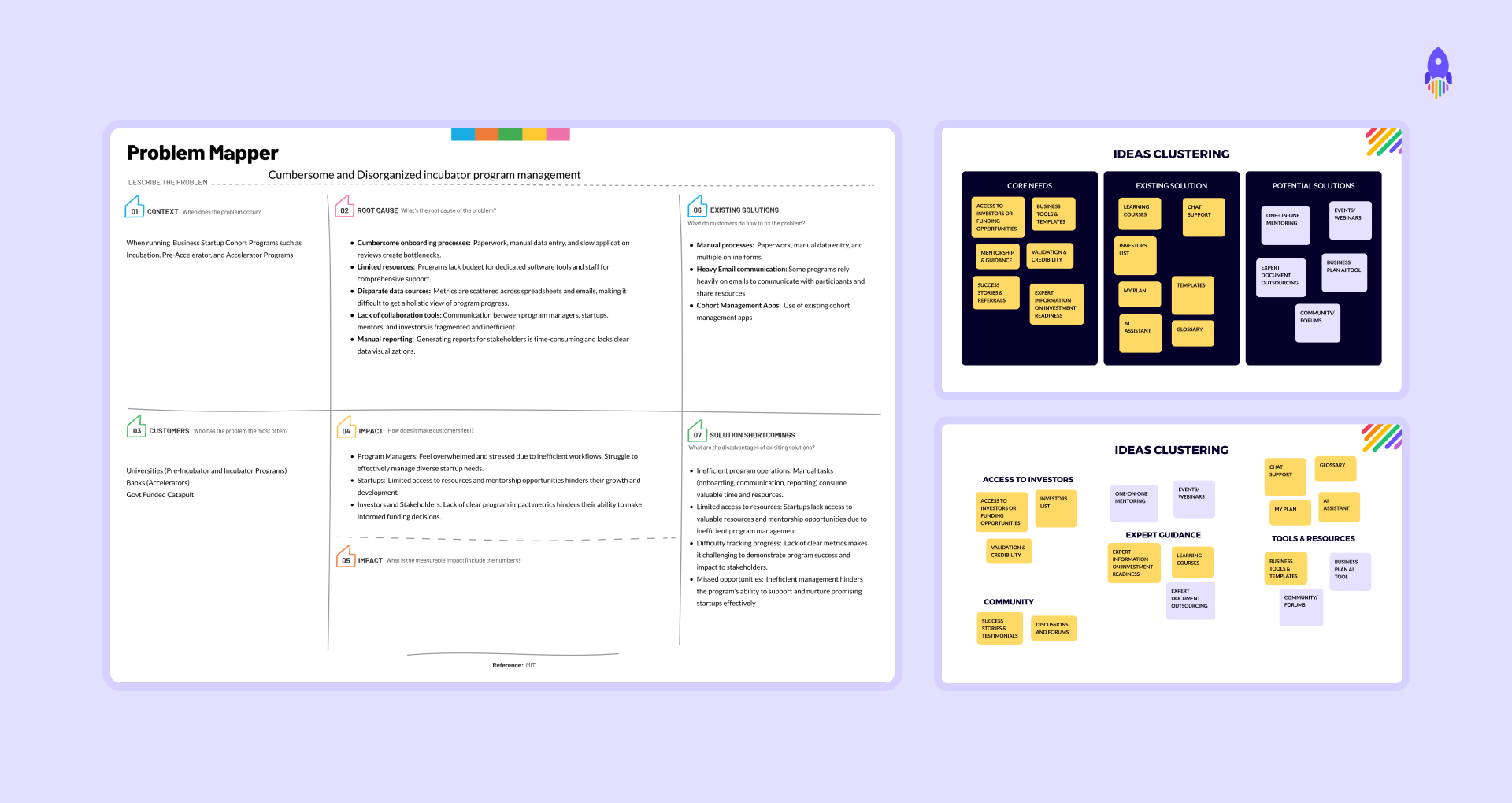
Armed with insights from my research, I was assigned the ideation phase with a mission to create innovative solutions that would address the core issues using tools such as Problem Mappers, Ideas Clustering, and Brainstorming/Brainwriting. I took the lead in this phase, bringing together the team’s creative energy to brainstorm new concepts. I envisioned a platform that wasn’t just functional but also delightful to use—a place where founders could easily navigate resources and feel motivated to continue their learning journey.
A User-Centric Approach: Our UX Design Process
At Funding Hero, our UX design process was a blend of creativity, research, and iteration. I approached the project with a user-first mindset, ensuring every decision was grounded in real user needs and feedback. My goal was to create an experience that was not only functional but also engaging and delightful for aspiring founders.
Empathy &
Research
Through user feedback from surveys and interviews, and a professional audit, we gained valuable insights into their needs, frustrations, and goals. This guided our design process.
Prototyping &
Design Sprints
We ran several design sprints to rapidly prototype our ideas. This iterative approach allowed us to quickly test concepts, gather feedback, and refine the designs to better meet user needs.
Testing &
Iteration
We embraced continuous improvement by iterating on our designs based on user feedback and testing. This ensured that our solutions evolved to meet the changing needs of our users.
Agile
Collaboration
We collaborated closely with developers, using an agile approach with Slack and Figma to ensure seamless communication and design handoffs to achieve our goals.
Designing the Future: Crafting User-Centric Interfaces
With a clear direction in mind, I focused on designing key user flows and interfaces that would enhance the overall experience. This included reimagining the onboarding process, simplifying it from a cumbersome, multi-step ordeal to a straightforward, user-friendly signup. I also worked on the business plan section and CommercialHero screens, ensuring they were not only visually appealing but also intuitive and easy to use.
Collaboration and Iteration: Building a Better Platform Together
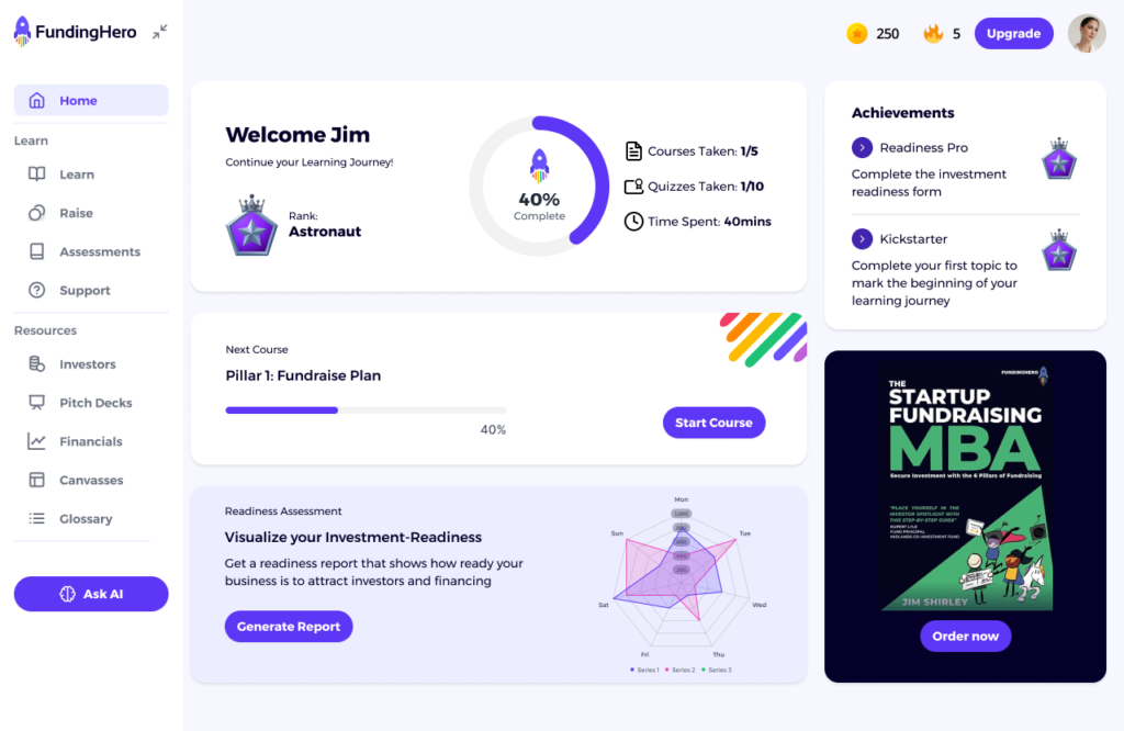
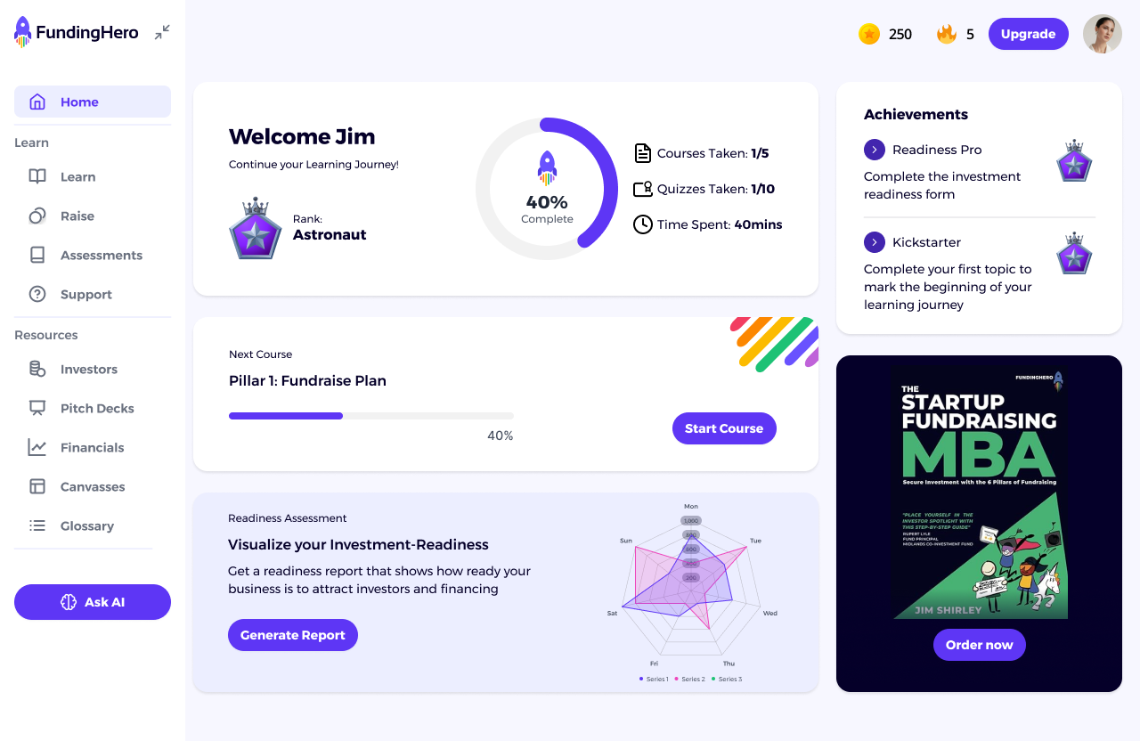
Collaboration was at the heart of this project. Working closely with a talented team of UX designers and our product lead, we ran several design sprints to bring our ideas to life. Prototyping, testing, and iterating became our mantra. We gave the e-learning platform a fresh, clean look with an improved layout, more effective CTAs, and a streamlined navigation system that reduced the previous 4-level deep menus to just 1-2 levels.
Dashboard UI (Before and After)
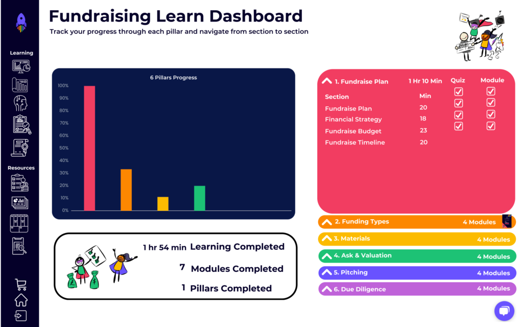
Before
After

<< Swipe to reveal >>
Business Plan UI (Before and After)
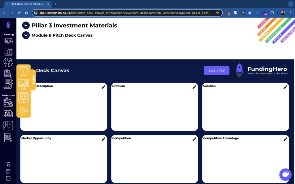
Before
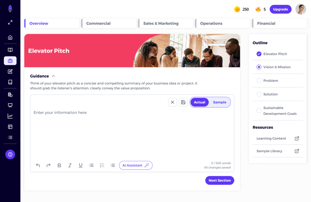
After

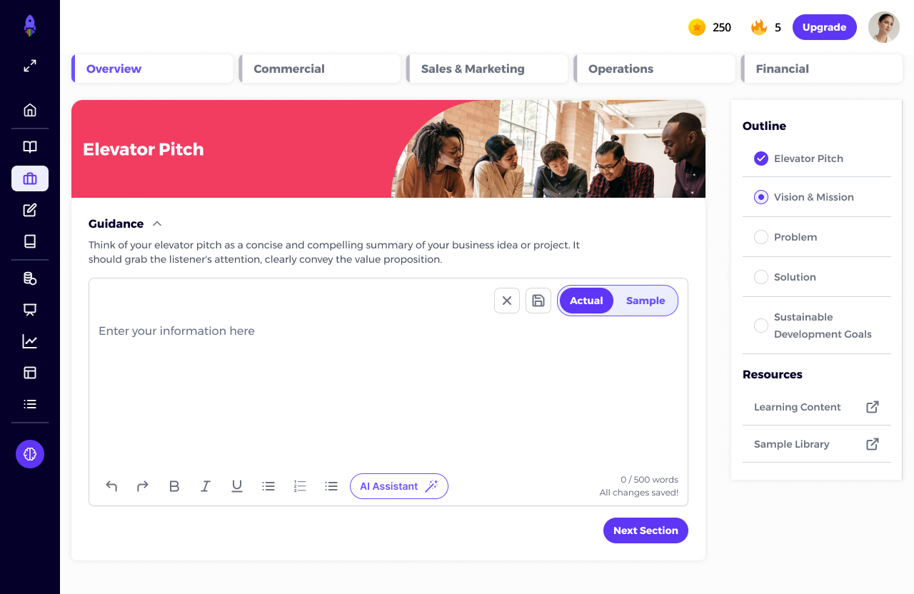
<< Swipe to reveal >>
Gamifying Learning: Making Education Engaging and Fun
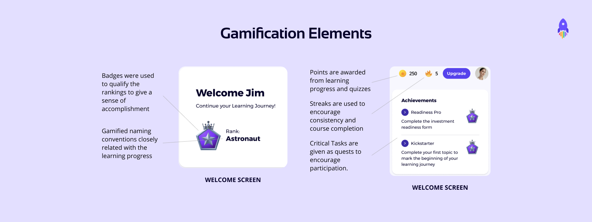
Understanding that learning can sometimes be tedious, we added a layer of gamification to the platform. By introducing badges, achievements, and quiz games, we transformed the learning experience from something users felt they had to do into something they wanted to do. These elements provided a sense of progress and accomplishment, making the journey more enjoyable without compromising the quality of education.
Listening to Feedback: Iterating for Perfection
After our initial redesign, we conducted a second round of user testing. While the feedback was overwhelmingly positive, some users mentioned missing the brand’s original colors, which they had grown attached to. Others felt the e-learning screen was too cluttered. We listened closely and responded by refining the design further, incorporating the brand’s colors in a meaningful way and making the main sidebar menu collapsible to reduce visual noise.
Impact & Outcomes
The true test of any design project lies in its ability to achieve the client’s objectives. For DefenSync, the goal was to establish a strong online presence that generated qualified leads and ultimately, sales.

User
Retention
User
Satisfaction
Simplified
Navigation
Overcoming Challenges: A Funding Hero Success Story
One of the biggest challenges we faced at Funding Hero was the ambitious timeline set by the CEO. With a limited team and a tight deadline, we quickly realized that a drastic change in our approach was necessary.
To overcome this hurdle, we instituted a rigorous prioritization process. By focusing on the most critical features and eliminating non-essential elements, we were able to streamline our workflow and stay on track. Additionally, we implemented a sprint-based methodology, breaking down the project into manageable chunks and setting clear deadlines for each phase.
Another challenge was resource allocation. With a small team of volunteers, we had to carefully distribute tasks based on individual strengths and expertise. This ensured that each team member was working on tasks that aligned with their skills, maximizing efficiency and productivity.
Despite these obstacles, we were able to successfully navigate the project and deliver a product that exceeded expectations. Our ability to adapt, collaborate, and prioritize proved to be invaluable in overcoming these challenges and achieving our goals.
Conclusion: A Platform Reborn
In just seven weeks, we took a struggling platform and turned it into a powerful tool that now truly serves the needs of aspiring founders. The redesign not only improved the retention rate but also enhanced user satisfaction, making the learning process smoother and more engaging. My experience at Funding Hero was not just about redesigning an application; it was about understanding users’ needs, working collaboratively, and creating a product that makes a difference. This project was a testament to the power of thoughtful design and the impact it can have on real-world outcomes.
THANKS FOR STOPPING BY
Feel free to get in touch
